Packing Orders Lightning Speed
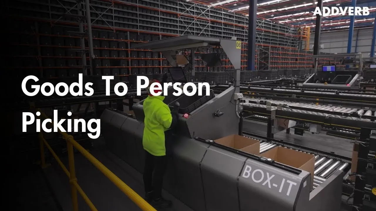
GTP - Goods to Person
Redesigning the backbone of automated fulfillment for over 100,000 operators across 100+ industries globally: A UX case study of Addverb's Goods-to-Person (GTP) system.
Client
Addverb
Date
May 2024 - Jan 2025
Industry
Robotics & Automation
Scope of work
Product Design
UX Research
Best view
Desktop/Tablet

WHat is GTP?
A goods-to-person (GTP) system is a warehouse automation technology where automated systems, like robots or shuttles, deliver items directly to workers at a designated workstation, rather than workers traveling to retrieve items from storage. This system enhances efficiency, reduces travel time and physical strain for workers, and improves order fulfillment accuracy.
Problem
Problem
The initial Goods-to-Person (GTP) system featured a poorly designed interface, created by developers, that overwhelmed operators with irrelevant elements. This resulted in a highly inefficient workflow where even picking a single order necessitated an excessive 5-6 clicks.

Goals
The initial Goods-to-Person (GTP) system featured a poorly designed interface, created by developers, that overwhelmed operators with irrelevant elements. This resulted in a highly inefficient workflow where even picking a single order necessitated an excessive 5-6 clicks.
The initial Goods-to-Person (GTP) system featured a poorly designed interface, created by developers, that overwhelmed operators with irrelevant elements. This resulted in a highly inefficient workflow where even picking a single order necessitated an excessive 5-6 clicks.
User Goals
Pick orders quickly and efficiently
Easily understand and navigate the picking interface
Focus on relevant information without distractions
Business Goals
Increase order fulfillment throughput
Reduce operator error rates
Pick orders quickly and efficiently
Easily understand and navigate the picking interface
Focus on relevant information without distractions
Pick orders quickly and efficiently
Easily understand and navigate the picking interface
Focus on relevant information without distractions
User GOaLs
Increase order fulfillment throughput
Reduce operator error rates
BUSINESS GOaLs
Business Goals
Increase order fulfillment throughput
Reduce operator error rates
Research Insights
Research Insights
I Conducted on-site study with over 300+ operators and analyzed their visual interaction patterns, click behaviors, and key task priorities.
Evaluated diverse user roles, personas, and accessibility needs across different industries and departments.
I identified two main factors causing user difficulties with the interface:
Environmental Stress + Poor UI: Physical workplace stress combined with the difficult interface increases error rates.
Daily Wage Dependency: Operators' earnings directly relate to their performance, making them reluctant to engage with an inefficient interface.
Found that operators cope by memorizing click sequences to navigate the poor interface and maintain productivity.

Competitive Analysis
Competitive Analysis
The robotics and automation industry is rapidly expanding to meet growing demands for faster order fulfillment across industries. I conducted a competitive analysis to understand how leading manufacturers balance performance with usability. This analysis examined three top warehouse automation and Goods-to-Person (GTP) system providers, focusing on how their interfaces address common operator frustrations: information overload, excessive jargon, and poor UX/UI design.
Here's a summary of how these industry leaders create effective user experiences while maintaining operational efficiency.
 View Full Competitive Analysis in Notion


Early Iterations
We really wanted to make the GTP picking screen super easy to use, so we thought about a 'no-click' approach. Since the screen was a bit far away, our main thing was making sure folks could see right away what they needed to grab and how many. We made the product and quantity super clear and big.
Later on, we realized that finding where to put the stuff was also taking up time. Imagine having to look for a tiny light in a big wall of boxes – it could be a wall of six, twelve, or even a ton of small totes! So, we had this idea to give people a nudge in the right direction on the screen, just to help them spot where to look in that grid of lights.
We went through loads of tries – more than 20! It was actually pretty tough to get rid of all the old buttons and weird words on the screen that the operators weren't even using anymore. We really wanted to clean things up and make it simpler.Here's a summary of how these industry leaders create effective user experiences while maintaining operational efficiency.
Our Design Principles
The challenge was to design for a unique environment: a mounted screen. This meant we couldn't just create a typical interface. Our goal was to make the experience inclusive for every user, regardless of their height or how far away they were standing. We approached this by designing with three core principles in mind.
1. Less is More We focused on reducing the need for interaction. The goal was for people to get what they needed quickly and efficiently, minimizing time spent at the screen itself.
2. Visual Clarity First To ensure the design was useful from a distance, we prioritized visual weight. We made sure that even someone standing several feet away could easily read and understand the most important data.
3. Intentional Accessibility We made sure the interface was physically accessible for people of different statures. The entire layout was designed to be easily usable, making the experience feel natural and effortless for everyone.

Iteration 1
Iteration 1

Iteration 2
Iteration 2

Iteration 3
Iteration 3
Early Iterations
We really wanted to make the GTP picking screen super easy to use, so we thought about a 'no-click' approach. Since the screen was a bit far away, our main thing was making sure folks could see right away what they needed to grab and how many. We made the product and quantity super clear and big.
Later on, we realized that finding where to put the stuff was also taking up time. Imagine having to look for a tiny light in a big wall of boxes – it could be a wall of six, twelve, or even a ton of small totes! So, we had this idea to give people a nudge in the right direction on the screen, just to help them spot where to look in that grid of lights.
We went through loads of tries – more than 20! It was actually pretty tough to get rid of all the old buttons and weird words on the screen that the operators weren't even using anymore. We really wanted to clean things up and make it simpler.
Our Design Principles
The challenge was to design for a unique environment: a mounted screen. This meant we couldn't just create a typical interface. Our goal was to make the experience inclusive for every user, regardless of their height or how far away they were standing. We approached this by designing with three core principles in mind.
1. Less is More We focused on reducing the need for interaction. Instead of requiring users to tap through multiple screens, we aimed to display the most critical information at a glance. The goal was for people to get what they needed quickly and efficiently, minimizing time spent at the screen itself.
2. Visual Clarity First To ensure the design was useful from a distance, we prioritized visual weight. This meant using large, high-contrast typography and icons for key information. We made sure that even someone standing several feet away could easily read and understand the most important data.
3. Intentional Accessibility We made sure the interface was physically accessible for people of different statures. This included carefully considering the placement of interactive elements to be within easy reach for both shorter and taller users. The entire layout was designed to be easily usable, making the experience feel natural and effortless for everyone.


User PErsona
User PErsona
For our GTP system redesign, we conducted extensive user research to understand the diverse needs of operators. Initially, we identified three potential user personas: the Newcomer, the Professional, and a General user. Our on-site visits to numerous warehouses revealed a significant diversification in operator profiles based on factors such as age, geographical location, gender, and the specific industry of the company.
However, for the purpose of our core GTP system design, we focused on two primary personas that represented the spectrum of user experience:


PArticipatory Design Session
To facilitate a collabrative environement and as its our first hardware & Software UX revamp, we wanted to have all stake holders on same page, thus we conducted a 3 hour long participatry design workshop.
Shared Understanding and Alignment: The workshop created a common understanding of project requirements among all stakeholders.
Incorporating Diverse Perspectives: It brought together different viewpoints from various teams to inform design decisions.
Early Identification of Priorities and Disagreements: The exercise helped to quickly pinpoint what was most important and where opinions differed.
Empowerment and Buy-in: Stakeholders felt included in the design process, which increased their support for the project.

PArticipatory Design Session
To facilitate a collabrative environement and as its our first hardware & Software UX revamp, we wanted to have all stake holders on same page, thus we conducted a 3 hour long participatry design workshop.
Shared Understanding and Alignment:
The GTP workshop was a great way to get everyone—whether they were H/W & S/W Product Managers or part of the Product & Process Team—on the same page about what the project actually needs. By working together to prioritize different UI elements, we made sure everyone understood and agreed on what was most important for the interface, preventing confusion down the line.
Incorporating Diverse Perspectives:
Bringing together people from different teams, like Product Management and the Process Team, meant we had a variety of perspectives in the room. Each person looked at the product through their own unique lens, and by discussing and prioritizing requirements as a group, we were able to balance these different viewpoints and make more well-rounded decisions.
Early Identification of Priorities and Disagreements:
The exercise of marking which UI elements mattered most didn’t just show us what everyone agreed on—it also made it easy to spot where priorities differed. Catching these mismatches early in the design process meant we could talk them through and make informed choices, instead of running into bigger problems later.
Empowerment and Buy-in:
Perhaps most importantly, involving everyone in this hands-on prioritization helped stakeholders feel genuinely included. When people see their voice matters and shapes the outcome, they’re much more likely to support and champion the final product.
Early Iterations
We really wanted to make the GTP picking screen super easy to use, so we thought about a 'no-click' approach. Since the screen was a bit far away, our main thing was making sure folks could see right away what they needed to grab and how many. We made the product and quantity super clear and big.
Later on, we realized that finding where to put the stuff was also taking up time. Imagine having to look for a tiny light in a big wall of boxes – it could be a wall of six, twelve, or even a ton of small totes! So, we had this idea to give people a nudge in the right direction on the screen, just to help them spot where to look in that grid of lights.
We went through loads of tries – more than 20! It was actually pretty tough to get rid of all the old buttons and weird words on the screen that the operators weren't even using anymore. We really wanted to clean things up and make it simpler.
Our Design Principles
The challenge was to design for a unique environment: a mounted screen. This meant we couldn't just create a typical interface. Our goal was to make the experience inclusive for every user, regardless of their height or how far away they were standing. We approached this by designing with three core principles in mind.
1. Less is More We focused on reducing the need for interaction. Instead of requiring users to tap through multiple screens, we aimed to display the most critical information at a glance. The goal was for people to get what they needed quickly and efficiently, minimizing time spent at the screen itself.
2. Visual Clarity First To ensure the design was useful from a distance, we prioritized visual weight. This meant using large, high-contrast typography and icons for key information. We made sure that even someone standing several feet away could easily read and understand the most important data.
3. Intentional Accessibility We made sure the interface was physically accessible for people of different statures. This included carefully considering the placement of interactive elements to be within easy reach for both shorter and taller users. The entire layout was designed to be easily usable, making the experience feel natural and effortless for everyone.
All the failed design iterations
Solution
After 10+ rejected iterations on our local automation environment with 10+ warehouse operators, we launched GTP v2.


Scalability
As a product grows from the ground up, the biggest challenge isn't just serving the first client, but preparing for the next 500. We realized that constantly redesigning our system for each new client was not only inefficient but also impossible to sustain. The question became: How do we build a system that can grow with us without requiring a complete overhaul every time?
Our solution wasn't another redesign, but a new approach to our core product. We created a front-end configurator.
This tool allows us to quickly and automatically generate a customized product for each new client based on their specific needs. By simply adjusting the configurations, we can tailor the system without starting from scratch.
This approach didn't just solve our immediate scalability issue; it transformed our product. What began as a one-off solution became a versatile tool that we could sell on its own, turning our biggest problem into a new business opportunity.

Scalability
As a product grows from the ground up, the biggest challenge isn't just serving the first client, but preparing for the next 500. We realized that constantly redesigning our system for each new client was not only inefficient but also impossible to sustain. The question became: How do we build a system that can grow with us without requiring a complete overhaul every time?
Our solution wasn't another redesign, but a new approach to our core product.
We created a front-end configurator.
This tool allows us to quickly and automatically generate a customized product for each new client based on their specific needs. By simply adjusting the configurations, we can tailor the system without starting from scratch.
This approach didn't just solve our immediate scalability issue; it transformed our product. What began as a one-off solution became a versatile tool that we could sell on its own, turning our biggest problem into a new business opportunity.


Scalability
As a product grows from the ground up, the biggest challenge isn't just serving the first client, but preparing for the next 500. We realized that constantly redesigning our system for each new client was not only inefficient but also impossible to sustain. The question became: How do we build a system that can grow with us without requiring a complete overhaul every time?
Our solution wasn't another redesign, but a new approach to our core product. We created a front-end configurator.
This tool allows us to quickly and automatically generate a customized product for each new client based on their specific needs. By simply adjusting the configurations, we can tailor the system without starting from scratch.
This approach didn't just solve our immediate scalability issue; it transformed our product. What began as a one-off solution became a versatile tool that we could sell on its own, turning our biggest problem into a new business opportunity.
THE IMPACT
After launching the redesigned GTP configurator, we meticulously tracked its performance against our core goals of simplicity and efficiency. Our new design wasn't just visually improved—it delivered significant, measurable results that validated our approach. We relied on a combination of quantitative data and direct user feedback to prove the redesign's success.


Heatmap of the GTP

Work Station Configuration
1
Proceed
Save & Exit
Process configuration for your GTP Station
This station will be used for
Select the type of scan
Number of scan
1
Picking & Tote-association
Picking only
Tote-association only
Proceed
Configuration
Welcome to GTP configuration.
This is your first time configuring your station, so let's get started. Here, we'll guide you through the process of selecting the right physical system and matching it with the most suitable options.
Remember: The choices you make here will directly influence how you work on your GTP Station.
Don't worry, you can always come back & edit.
Interactive Prototype: Click on Proceed to interact with the Configurator
Note: This prototype is just to provide looks & feels of the product
Interactive Prototype: Click on Proceed to interact with the Configurator
Note: This prototype is just to provide looks & feels of the product
THE IMPACT
After launching the redesigned GTP configurator, we meticulously tracked its performance against our core goals of simplicity and efficiency. Our new design wasn't just visually improved—it delivered significant, measurable results that validated our approach. We relied on a combination of quantitative data and direct user feedback to prove the redesign's success.
Heatmap of the GTP
Future
The success of the redesigned GTP configurator is just the beginning. Our next phase of work is focused on building on this foundation to create an even more powerful and scalable product. Our key priorities are:
Mobile-First Configurator: We aim to design a dedicated mobile experience to allow users to create and manage configurations on the go, with a focus on quick edits and real-time data access.
Advanced AI Integration: Exploring the use of machine learning to suggest optimal configurations based on a client's past behavior and industry standards, making the setup process even faster.
User-Generated Templates: Building a feature that allows clients to save and share their own configurations as templates, creating a community of best practices and accelerating new client onboarding.
Deeper Analytics: Creating a new set of analytics dashboards for clients, so they can better understand how their configurations are being used and optimize their own processes.
rise of hoca
The success of the GTP proved a powerful idea: that thoughtful design focused on simplicity and clarity could solve complex operational challenges. We saw an opportunity to apply this same philosophy to a new, critical area of the business.
This led to the development of our "picking system." At its core, this new system took the same design principles that made GTP so effective—reducing interaction, providing clear visual guidance, and simplifying complex tasks—and applied them to the high-stakes world of order fulfillment.
The resulting HOCA system, built on the same ideology, went on to become an essential tool for some of the biggest names in the industry, including Lenskart, Blinkit, Pepsico, and Reliance. It’s a testament to the idea that a great design philosophy isn’t just for one product; it’s a framework for building impactful solutions at scale.
Iimpact
After launching the redesigned GTP configurator, we meticulously tracked its performance against our core goals of simplicity and efficiency. Our new design wasn't just visually improved—it delivered significant, measurable results that validated our approach. We relied on a combination of quantitative data and direct user feedback to prove the redesign's success.
Heatmap of the GTP
Future
The success of the redesigned GTP configurator is just the beginning. Our next phase of work is focused on building on this foundation to create an even more powerful and scalable product. Our key priorities are:
Mobile-First Configurator: We aim to design a dedicated mobile experience to allow users to create and manage configurations on the go, with a focus on quick edits and real-time data access.
Advanced AI Integration: Exploring the use of machine learning to suggest optimal configurations based on a client's past behavior and industry standards, making the setup process even faster.
User-Generated Templates: Building a feature that allows clients to save and share their own configurations as templates, creating a community of best practices and accelerating new client onboarding.
Deeper Analytics: Creating a new set of analytics dashboards for clients, so they can better understand how their configurations are being used and optimize their own processes.
rise of hoca
The success of the GTP proved a powerful idea: that thoughtful design focused on simplicity and clarity could solve complex operational challenges. We saw an opportunity to apply this same philosophy to a new, critical area of the business.
This led to the development of our "picking system." At its core, this new system took the same design principles that made GTP so effective—reducing interaction, providing clear visual guidance, and simplifying complex tasks—and applied them to the high-stakes world of order fulfillment.
The resulting HOCA system, built on the same ideology, went on to become an essential tool for some of the biggest names in the industry, including Lenskart, Blinkit, Pepsico, and Reliance. It’s a testament to the idea that a great design philosophy isn’t just for one product; it’s a framework for building impactful solutions at scale.
future
The success of the redesigned GTP configurator is just the beginning. Our next phase of work is focused on building on this foundation to create an even more powerful and scalable product. Our key priorities are:
Mobile-First Configurator: We aim to design a dedicated mobile experience to allow users to create and manage configurations on the go, with a focus on quick edits and real-time data access.
Advanced AI Integration: Exploring the use of machine learning to suggest optimal configurations based on a client's past behavior and industry standards, making the setup process even faster.
User-Generated Templates: Building a feature that allows clients to save and share their own configurations as templates, creating a community of best practices and accelerating new client onboarding.
Deeper Analytics: Creating a new set of analytics dashboards for clients, so they can better understand how their configurations are being used and optimize their own processes.
Rise of hoca
The success of the GTP proved a powerful idea: that thoughtful design focused on simplicity and clarity could solve complex operational challenges. We saw an opportunity to apply this same philosophy to a new, critical area of the business.
This led to the development of our "picking system." At its core, this new system took the same design principles that made GTP so effective—reducing interaction, providing clear visual guidance, and simplifying complex tasks—and applied them to the high-stakes world of order fulfillment.
The resulting HOCA system, built on the same ideology, went on to become an essential tool for some of the biggest names in the industry, including Lenskart, Blinkit, Pepsico, and Reliance. It’s a testament to the idea that a great design philosophy isn’t just for one product; it’s a framework for building impactful solutions at scale.


